Webflow redesign for a recruitment & consulting firm to structure their offering and reflect a new ambition
A multilingual Webflow site, designed to clarify Sparagus' offerings, showcase their new brand identity, and tangibly support their acquisition goals.
Customer
Project date
Services
Website
in revenue
pages developed
consultants
languages added
Context
Following a strategic transformation and a complete rebranding, Sparagus needed to entirely rethink its website.
The existing site no longer reflected their current positioning: a hybrid player combining recruitment, consulting, and managed services, with a clear stance in the European market.
Neither their offering, their target audiences, nor their brand image were represented in a fair and structured way.
The goal: to create a site capable of conveying their positioning, highlighting their new brand identity, clarifying their offering, and tangibly supporting their teams' business objectives.
Challenges
Sending the right message
Reflecting the unconventional, human-centric company that is Sparagus, while ensuring credibility and expertise.
Clarifying an expanded offering
Presenting their three offerings (recruitment, consulting, managed services) in a readable way and introducing the Sparagus Hubs.
Showcasing their new brand identity
Integrating the universe created during the rebranding: a strong, unconventional, and human-centric visual direction.
Supporting international expansion
Creating a site available in 3 languages, capable of clearly addressing multiple markets.
Ensuring long-term performance
Building a solid design system and a site that is easily maintainable by their teams.
Our approach
Strategy & site architecture
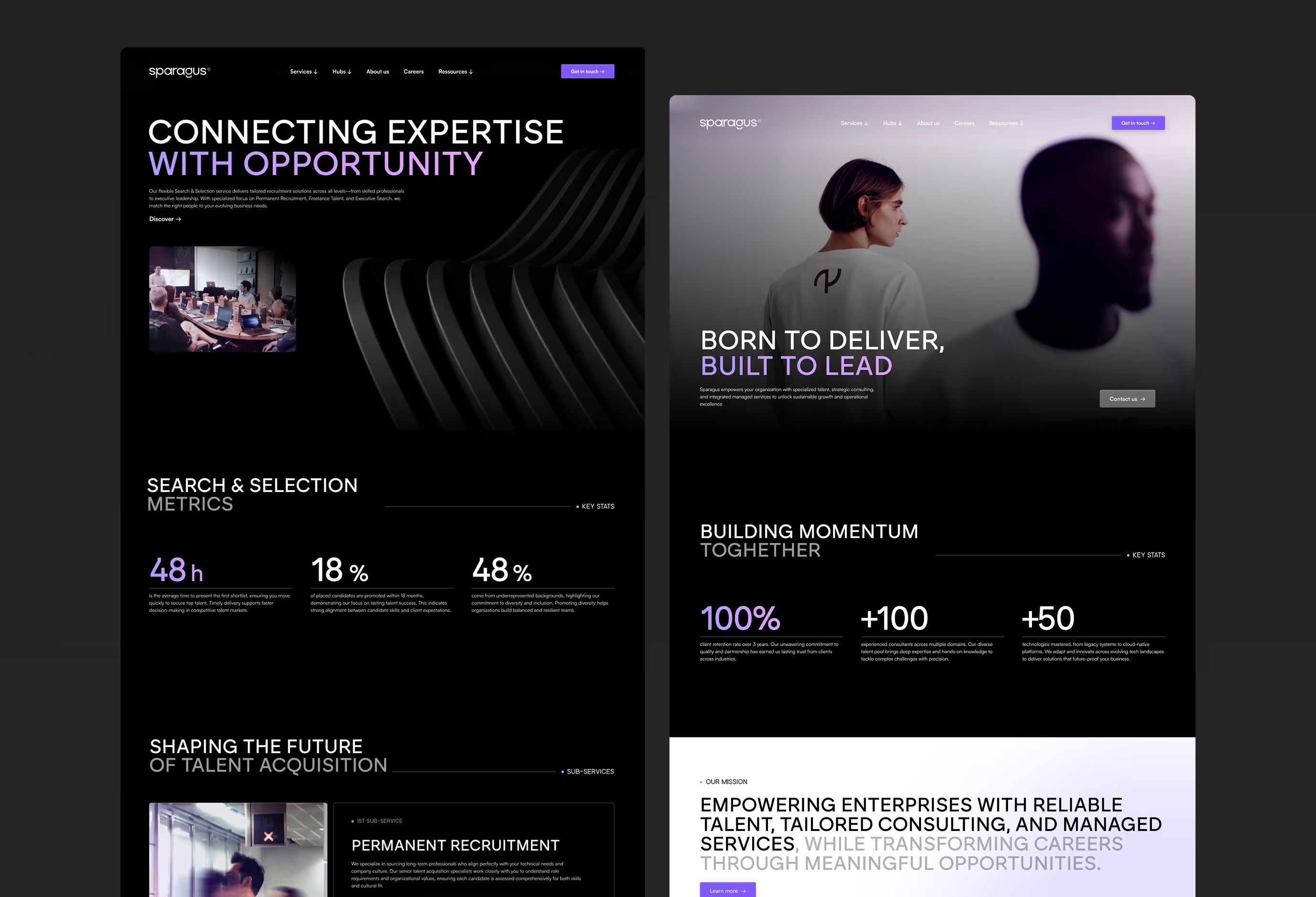
We began by reviewing the site's architecture as a whole. The goal: to offer clear navigation, particularly between the offerings and the Hubs. The site needed to reflect their hybrid model and guide each type of visitor to the right content.
- Structuring offerings around the three pillars of Sparagus: recruitment, consulting, managed services
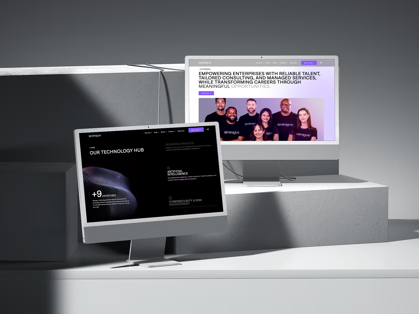
- Creation of "Hub" pages to present vertical expertise (Sparagus Technology, Sparagus Engineering, Sparagus B&O) in a readable and consistent manner
- Clarification of user journeys to address the two main target audiences: companies & talent
- 30+ pages created and designed as acquisition assets, focused on conversion and credibility
The goal here wasn't to reinvent everything, but to structure their ecosystem so that every visitor could instantly understand what Sparagus does, how they do it, and for whom. This framework laid the foundation for a clear, consistent site aligned with their new reality.
Copywriting & content structuring
In co-creation with the Sparagus teams, we wrote all of the site's content. The goal: to strike a balance between an expert stance and a direct tone, speaking to both companies and talent while clarifying their offerings.
- A clear, straight-to-the-point message aligned with the tone of voice defined during the rebranding
- Content designed to address two distinct audiences—companies and talent—while maintaining overall consistency
- A clear distinction between Hubs (areas of expertise) and services (types of intervention) to avoid any confusion
Every word was chosen to serve their positioning strategy while remaining true to their DNA: serious, human, and unconventional.
Art direction & mockups
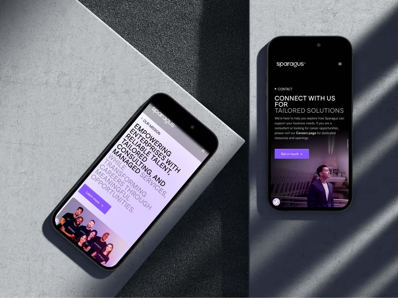
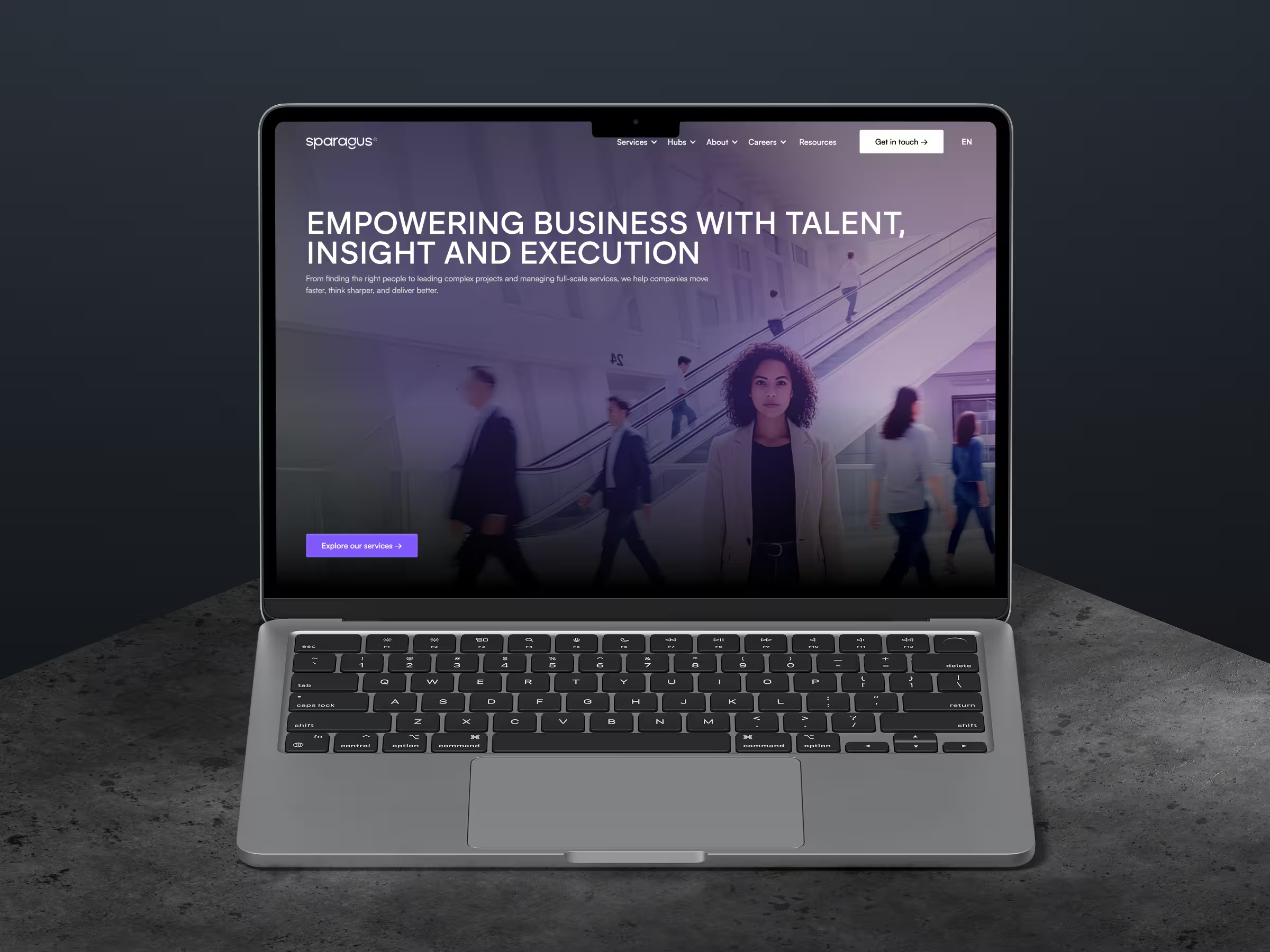
The site had to reflect the universe created during the rebranding: immersive, authentic, and performance-driven, yet deeply human.
- Full integration of the new visual identity: colors, typography, iconography, photos, and shapes.
- Selection and processing of all site images with a strong photographic direction:
- spontaneous portraits
- blur effects to illustrate constant movement
- neutral tones with hints of mauve
- showcasing talent
Each page was designed and presented in Figma to allow us to focus fully on the project's art direction before development.
Webflow development & design system
To ensure performance, scalability, and autonomy, we developed the entire site on Webflow.
- Multilingual integration in 3 languages: FR, EN, NL
- Implementation of a structured CMS to manage blog posts, client case studies, and job offers
- Complete tracking setup (tags, goals, events) to monitor conversions and user journeys
- Creation of a complete, documented design system: reusable components, standardized styles, and ready-to-use templates
The site was built to evolve easily. The Sparagus team can now add pages, edit content, or update sections without depending on the agency.
ATS connection via Wized
The site also needed to integrate with their ATS to automatically publish job openings.
We used Wized to connect their external database to Webflow, while ensuring:
- Seamless integration with Webflow
- Fast, fluid display without design breaks
- A consistent experience with the brand identity, right down to the job descriptions
Everything was designed to ensure performance and autonomy without compromising aesthetics or UX.
Results
- A premium, immersive site aligned with Sparagus's new positioning
- A clear, structured offering designed to perfectly address their client segments
- Sales and brand awareness support tailored to acquisition goals
- A robust system ready to be managed by their teams, with no compromise on quality
These foundations then served as the basis for our SEO and GEO support, which doubled the site's visibility on Google.
Recent client projects
Explore our latest client success stories


